Overview
The Actions Dashboard gives you a snapshot of how your actions are progressing across the organisation. Use it to quickly identify overdue actions, spot RAG status trends, and understand which areas need attention — without having to open individual action records. You can reach this page by clicking Actions in the sidebar.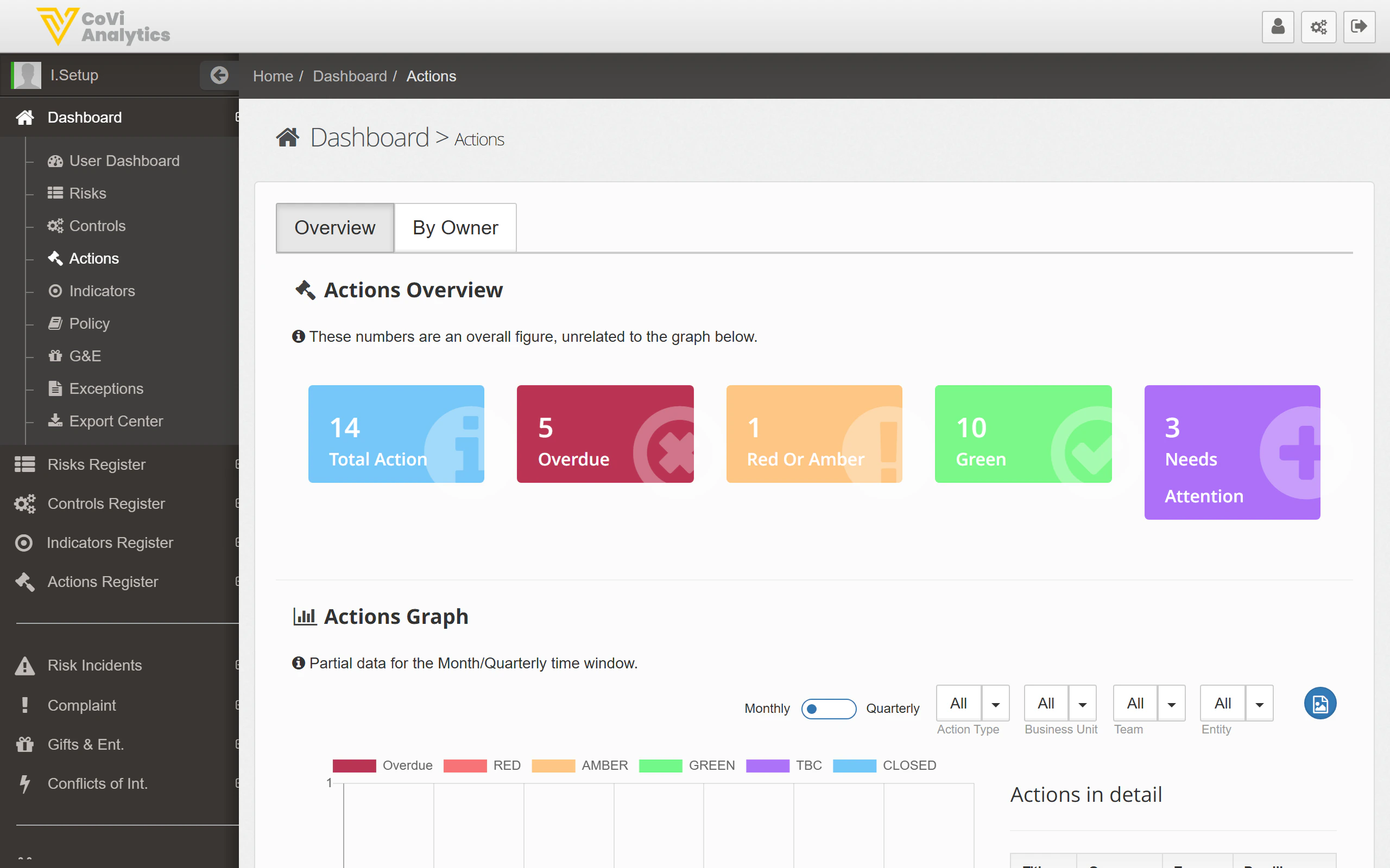
How to use it
Status tiles
The coloured tiles at the top show key metrics at a glance:- Total Actions — the total number of actions across all entities (e.g., 14)
- Overdue — actions past their due date that need immediate attention (e.g., 5)
- Red or Amber — actions rated as underperforming or at risk (e.g., 1)
- Green — actions on track and operating as expected (e.g., 10)
- Needs Attention — actions flagged for follow-up (e.g., 3)
Dashboard tabs
Use the tabs to change how actions are grouped:- Overview — the default summary with status tiles and a trend graph
- By Owner — see how actions are distributed across owners, useful for workload balancing
Actions Graph
The bar chart shows action status over time. Use the toggle to switch between Monthly and Quarterly views. The dropdown filters let you narrow by:- Action Type — focus on a specific category of action
- Business Unit — filter to a particular business area
- Team — narrow to a specific team’s actions
- Entity — view actions for a single legal entity
Actions in detail
The table at the bottom lists individual actions with their key details. Click any row to open that action’s full record in the Action Card.Tips & Tricks
The Actions Dashboard follows the same layout as the Controls Dashboard. If you are familiar with one, you will find the other straightforward to navigate.